AaBbCc
Heavy
features
dlig
ss01
ss02
ss03
ss04
ss05
ss06
ss07
ss08

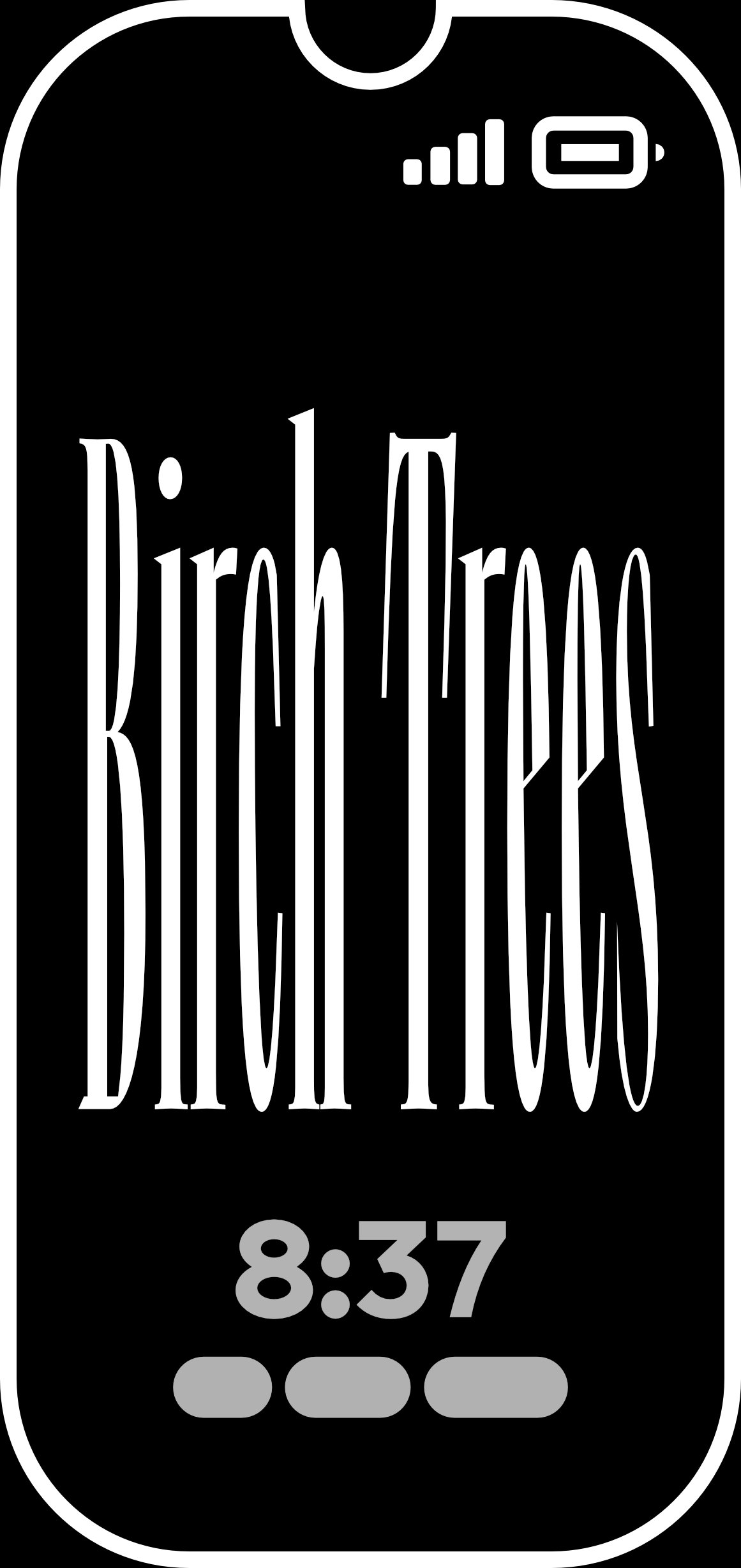
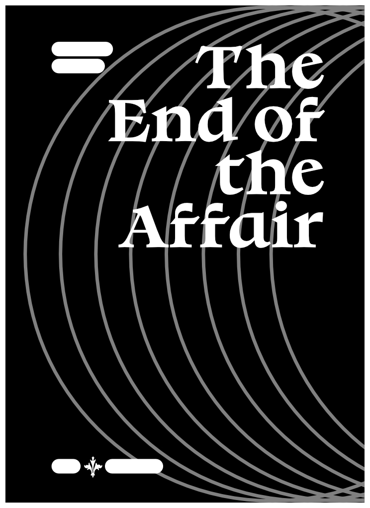
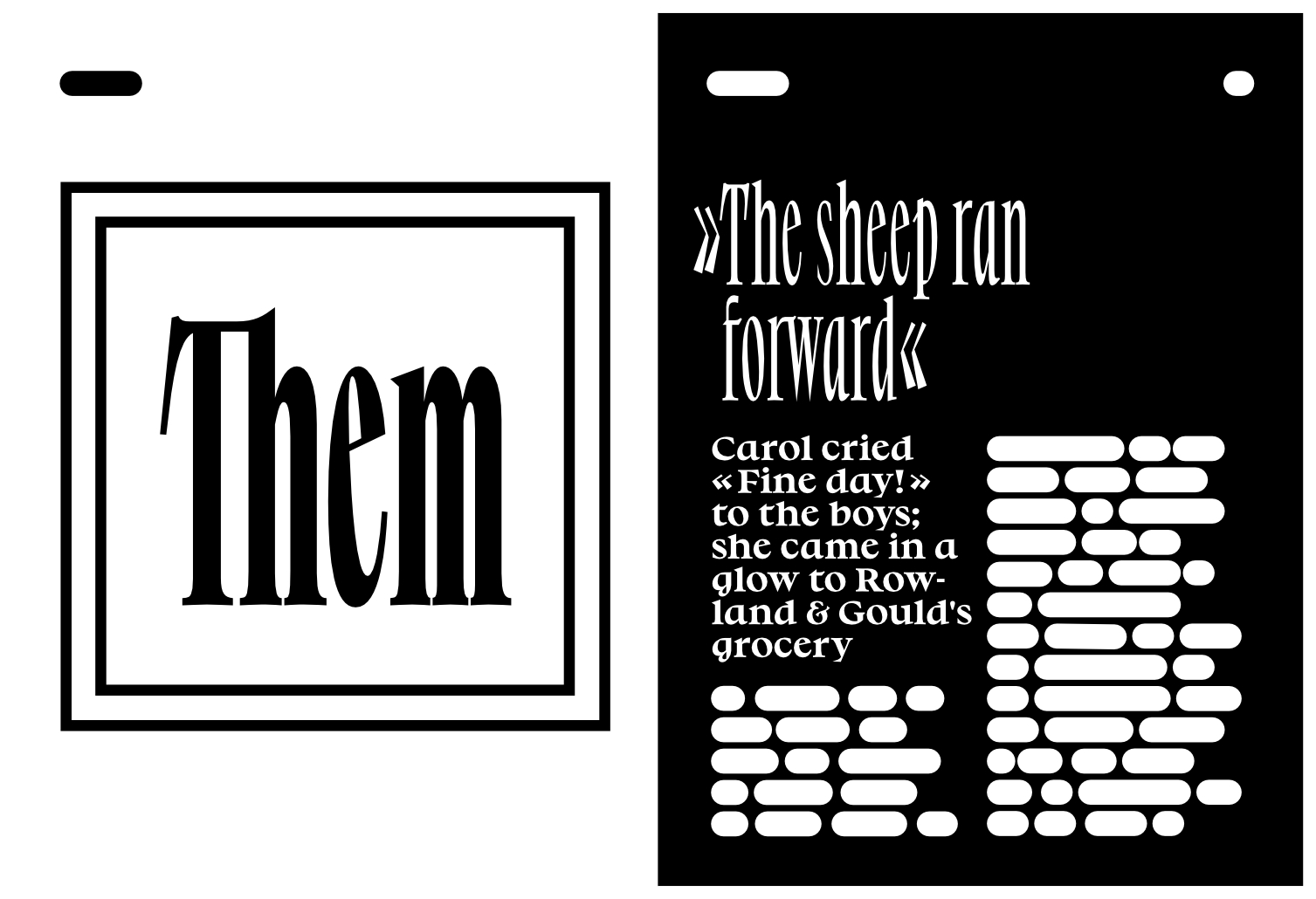
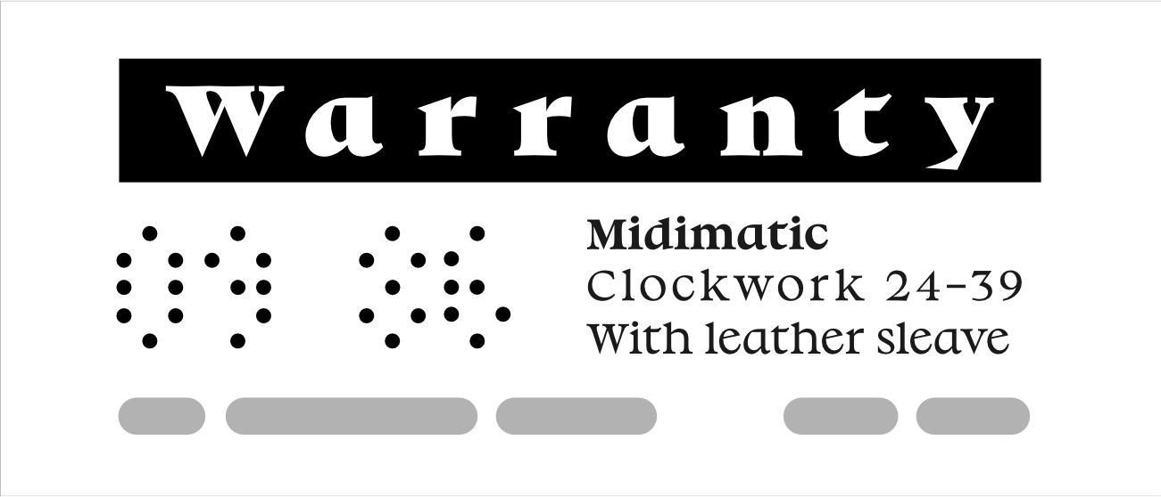
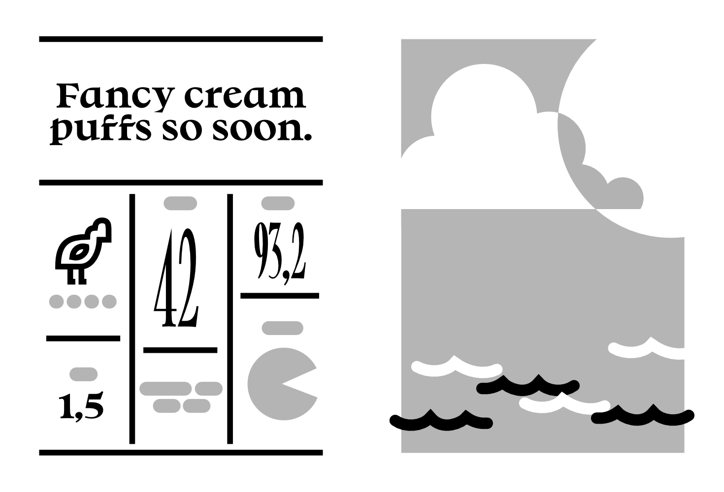
No. 3 Series is a typeface for a variety of large scale applications including titling, visual identities, books, magazines, mobile patterns and websites. It has the characteristics of humanist letters and covers three widths in large steps, Normal, Narrow and Poster. Furthermore No. 3 Series is to a large extend influenced by writing and cursive writing. It is the outcome of revisiting the design principles that lead to movable type during the Renaissance.
When the first letters were cut into metal during the Renaissance, how did their designers approach the task to adapt the existing writing habits into an efficient and aesthetic type system for reproducibility? We can retrace some of their intentions by reading historical sources and comparing specimen. No. 3 Series is the outcome of revisiting this transition from writing with the pen to movable type. It is influenced by writing and cursive writing and imagines deviations from the traditions we know.
The principle behind the shapes of the a, d, p and q of the lowercase alphabet is the rotation of an italic letter written with a broad nib pen. Italic handwriting usually has a slope which in this case is reduced to zero, but the underlying theoretical strokes are preserved.
| Release | 2021 |
| Weights | Regular, Bold, Heavy |
| Format | OpenType |
| Version | 1.446, May 2023 |
| Language Support |
See the specimen for supported character set |